
Designtuitive.com
Key InDesign tasks: Designing for digital & print
InDesign is used for a multitude of design tasks, but to give you a way in to the program we'll look briefly at three. Firstly, designing for digital or print.
Creating the Facebook image below is a good example of what InDesign does well:
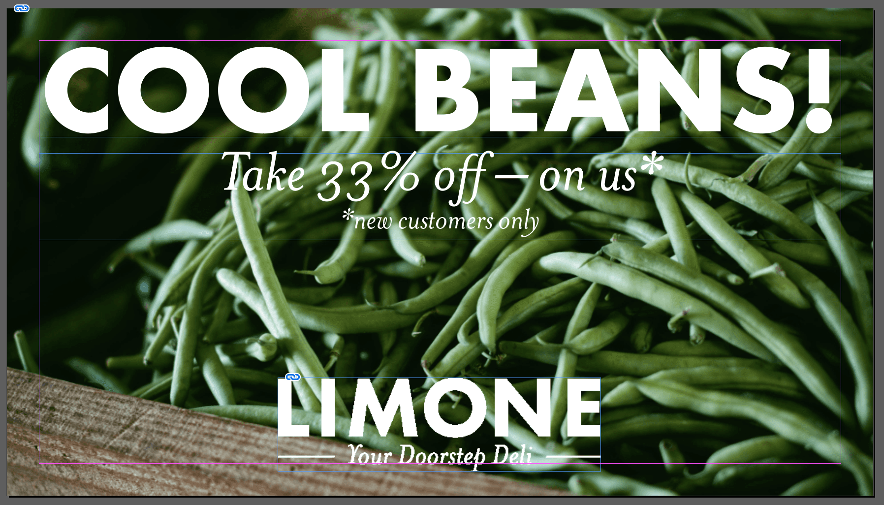
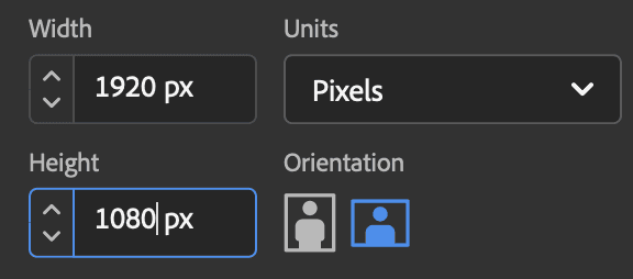
To create it from scratch, you'd be given a specific sized page to create (in this case, you'd refer to Facebook's guidelines and be given width and height measurements in pixels) and you'd start by creating a document of that size by using File > New > Document. Having chosen the Web option, you'd insert the required values into Width and Height:
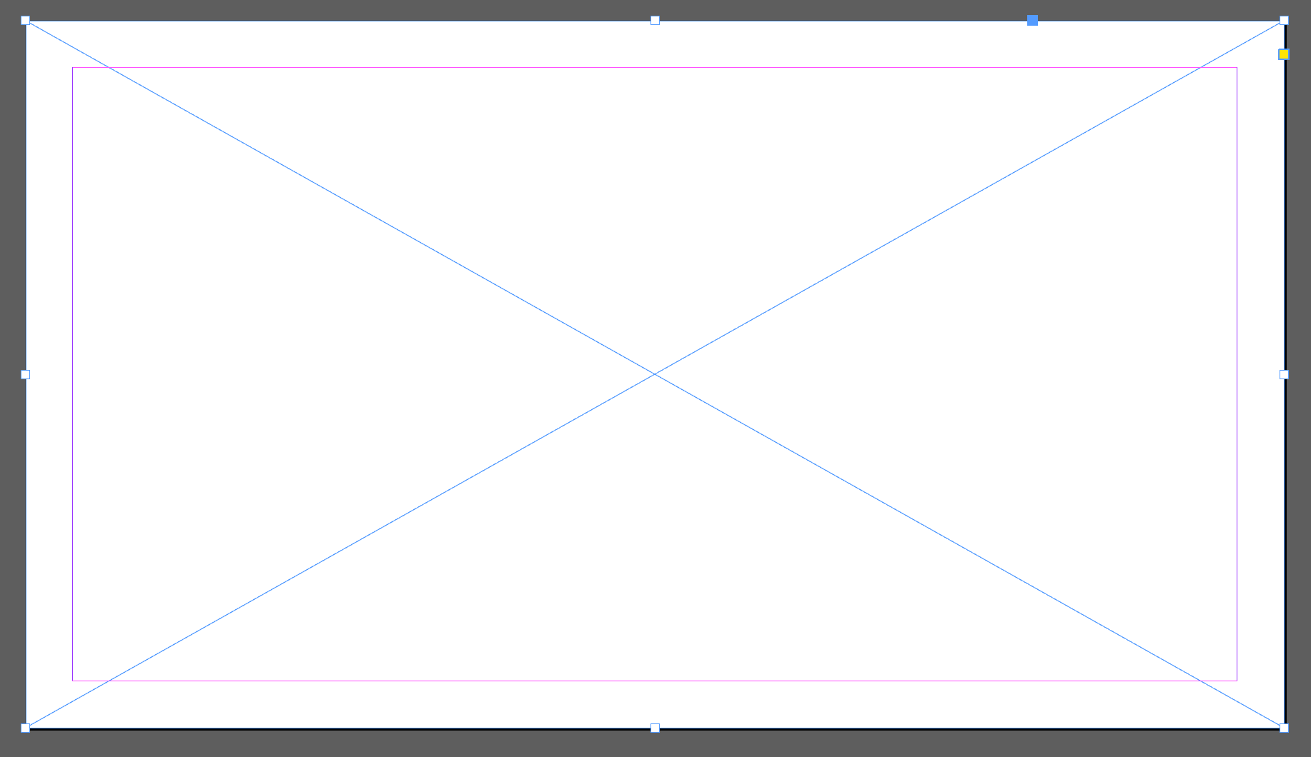
You'd now be looking at a blank page, and the first task is to create a frame for the large background image. Drag the Rectangle Frame tool (as described in our Key InDesign tools guide) to create a frame that covers the whole page:
To fill that empty frame (indicated by the blue "X") you'd make sure it's selected, then choose File > Place, and choose the image you'd want to insert. This image (from Unsplash.com) fits the brand:
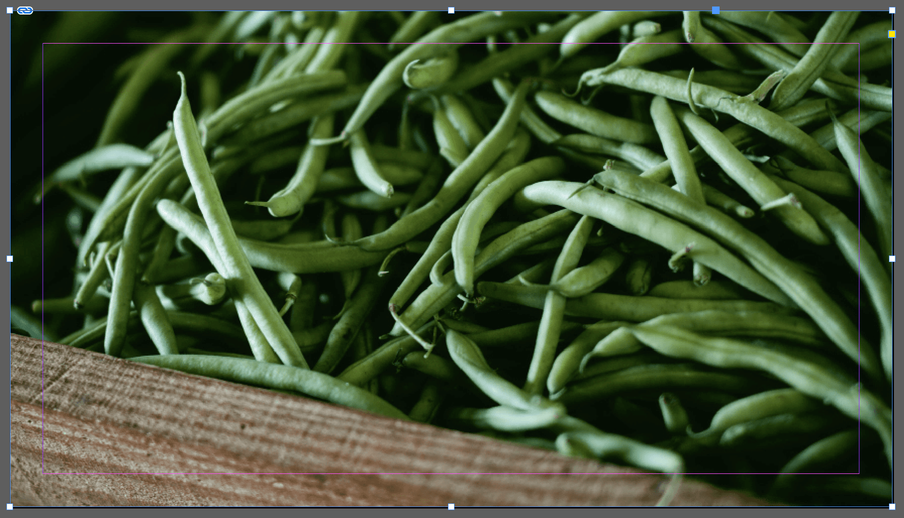
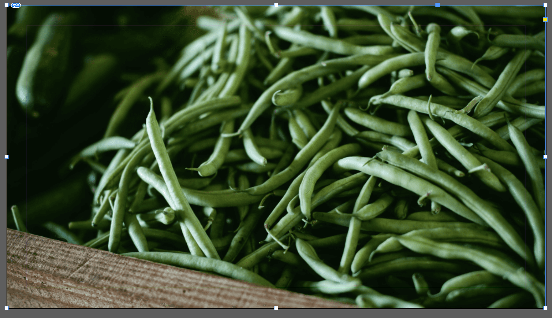
Once an image has been place, best practice is to scale the image. Choose Object > Fitting > Fill Frame Proportionally to make sure all that the whole frame is filled (without stretching the image):
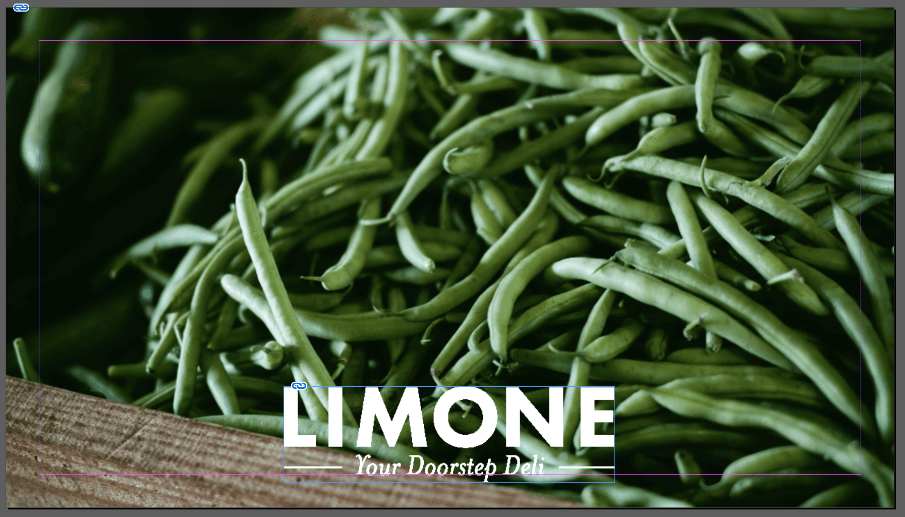
You'd repeat the same process of creating an empty frame for the logo, then use File > Place to import it. Logos are typically created in Adobe Illustrator.
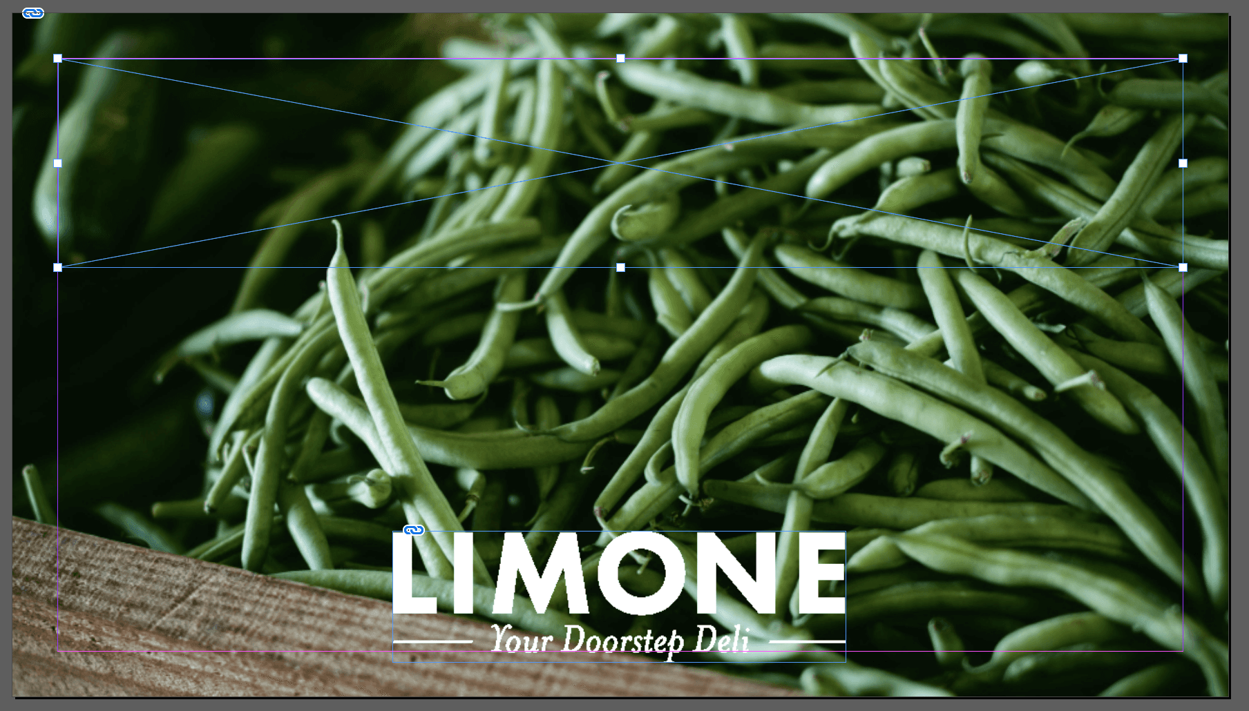
To add the large text, create another empty frame at the top of the document, then click inside it with the Type tool (as described in our Key InDesign tools guide). Then you can type the text, and adjust the font and size. If you can't see those options on either the top or right of your screen, choose Window > Type and Tables > Character. The type I'm using follows this brand's style guide, which is generally how designers work, to keep things aligned to the brand values. If you'd like to learn how to sharpen up your graphic design skills alongside your Adobe skills, check out our Graphic Design for Marketers course.
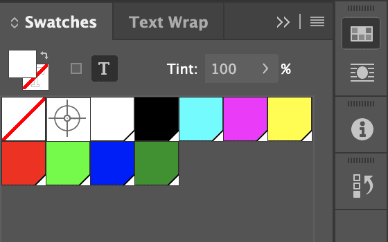
To change the colour of the text to white, use the Swatches panel (Window > Color > Swatches) and select the "Paper" swatch.
Once another text frame has been created for the final bit of text, the design is finished. This is an InDesign file, but no use for putting on a website. To do that, choose File > Export and select PNG. This will create a separate png file that can be uploaded to a website or social media site.

The A4 poster below is an example of a design created for commercial print instead of digital (it's also another brand you can work with that's featured in our Graphic Design for Marketers course).

The steps you'll use in InDesign are largely the same: you can probably recognise the frames that contain either text or images, and that the colours, images and fonts come from a different set of brand guidelines. The key differences are firstly that you'd start from a typical print size, in this case A4. To do that, you'd create a new document as we looked at above, only you'd choose the "Print" option instead of "Web" and choose one of the preset page sizes, in this case A4.
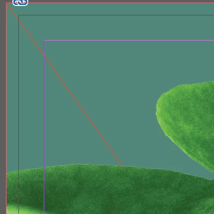
The second key difference is that you'll need to prepare the design in a way that means it will print correctly when it's sent to a commercial printer. One example of this is the "bleed" that is required around the edge of a document – see the red line in the image above. If you want to know more about this, we've written a separate lengthy guide about the checks you'd want to make when designing for commercial print.
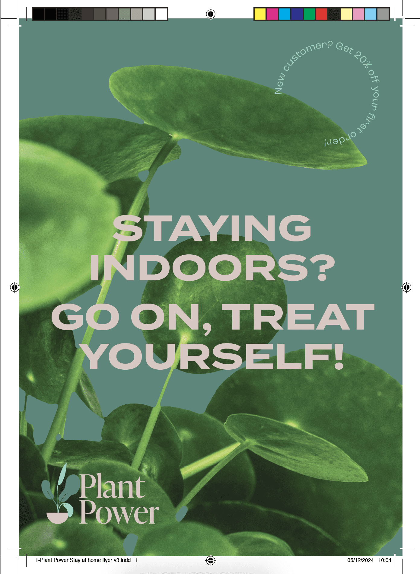
The third key difference is that rather than exporting your document as a png, you'd export it as a pdf to send to the printer. The commercial print guide goes into details of how to go about that, should you want to know more. Here's what the final print ready pdf might look like:
Read our other guides to InDesign
Explore our Graphic Design for Marketers course

